Accelerating the Institutional Adoption of Ethereum
Brand assets, colors, files and usage rules.
Get the assetsThe mark
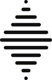
Eleven rounded bands, widest at the middle. One drawing at every size, in the ink of whatever it stands on.
Clear space
The space of two bands on every side, so it can be measured off the mark itself.
Minimum size
32px tall on a screen, 8mm in print. Below that the bands are too thin to hold apart, and the mark fills in.

Lockups
The mark with the name, in two arrangements, for both grounds. Use the file; do not rebuild it.
Primary lockup The first choice wherever it fits on one line.


Stacked lockup A narrow column, or a square.


Color
Each ground is shown with the mark in the ink it takes. Press a value to copy it.
Rules
Nine things not to do, each drawn wrongly on purpose.
Do not stretch it.
Scale it whole, from a corner.
Do not recolor it.
Dark or light. It takes no other ink.
Do not tilt it.
The bands are level, always.
Do not set it on a busy ground.
A flat ground of the brand’s own, nothing behind it.
Do not crowd it.
Keep the space of two bands clear on every side.
Ethereum InstitutionalDo not rebuild the lockup.
The name beside the symbol is drawn, not typed. Use the file.
Do not use the wrong file for the ground.
There is one for dark and one for light. Match them.
Do not squash it to fit.
If it will not go on one line, use the stacked lockup.
Do not set the name in capitals.
The name is never set in capitals, in any face, at any size.